Some Fonts to Consider
Date Posted: 27th JULY 2024
Selecting a font, especially for your book cover is an important part of the release of a book. It is the main thing a prospective buyer will see, the cover, the initial step in the sales pitch. A good cover can sell a low-quality book, but a bad cover can rarely sell even the greatest of books.
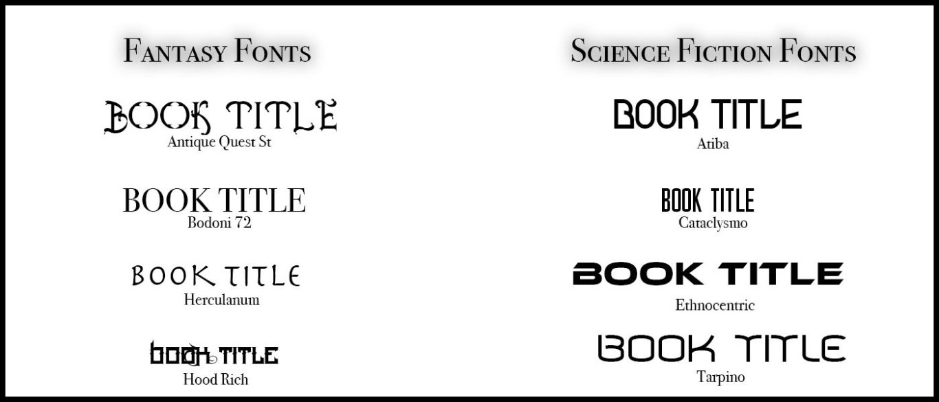
The image below is an example of soom of the top trending fonts when it comes to genre-envoking, from sight alone, it gives the viewer an idea of the contents of the book and what they can expect. This is good as some people want to find a 'fatasy' novel, for example, and you typographical efforts aids in them securing a book that they want.
Typically, on a cover, more than one font can be used. For the author name and title, this is expected, and a third font is rarely but sometimes, utilised. The first letters of a title, sometimes, can be a different font, to give you book a unique font identity. This is a technique that works well.

© Copyright. All rights reserved. Content not to be posted elsewhere without consent.
Contact: HERE
We need your consent to load the translations
We use a third-party service to translate the website content that may collect data about your activity. Please review the details in the privacy policy and accept the service to view the translations.
